Path:
Home
Page > [Services
>] Websites > Websites Background
Websites
BAKGROUND INFORMATION
Almost everyone is making websites nowadays. So do I. Have a look
at the pages below and decide if you would want me to design your website. I have learnt to avoid the pitfalls
that make websites difficult to read, abominating or repulsive, or will make the reader choose something else instead.
The website you are currently reading was designed,
created, uploaded, and is continuously maintained by Qomputor Education Datasystems AB. Although I favourize a
similar layout on all pages, it may sometimes vary when I try out new ideas.
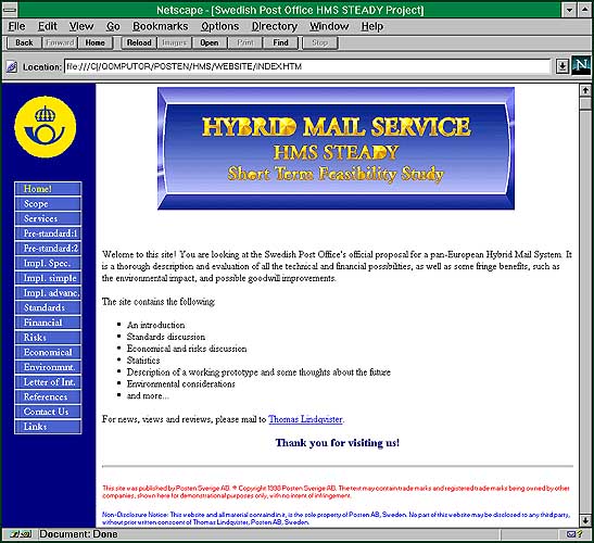
The Post Office
 The Swedish Post Office's Hybrid Mail System, a semi-electronic,
semi-physical alternative to ordinary paper mail, was to be presented to the EU, and the Post Office chose to present
it in the form of a website. I got a raw text from the Post Office and made all the illustrations and created the
environment of the site myself. To tell the truth, I got a few, not very uplifting illustrations to redesign. Below
you see the result.
The Swedish Post Office's Hybrid Mail System, a semi-electronic,
semi-physical alternative to ordinary paper mail, was to be presented to the EU, and the Post Office chose to present
it in the form of a website. I got a raw text from the Post Office and made all the illustrations and created the
environment of the site myself. To tell the truth, I got a few, not very uplifting illustrations to redesign. Below
you see the result.
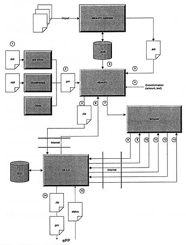
Before
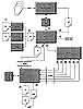 Before the treatment it looked like this. Not very beautiful,
no more than a sketch.
Before the treatment it looked like this. Not very beautiful,
no more than a sketch.
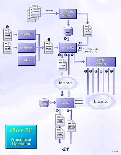
After
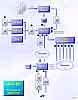 After my treatment in CorelDRAW it looked like this. Some difference?
A discrete, hopeful background means a lot, as does cohesively selected colours. All the pictures of the presentation
were created using the same colour range, the same typeface and the same background. This gives unity to the presentation.
After my treatment in CorelDRAW it looked like this. Some difference?
A discrete, hopeful background means a lot, as does cohesively selected colours. All the pictures of the presentation
were created using the same colour range, the same typeface and the same background. This gives unity to the presentation.
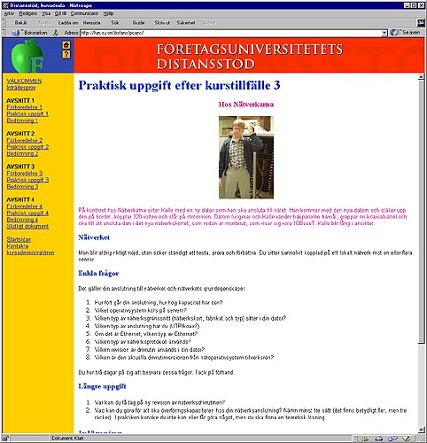
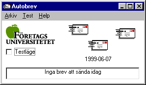
The Corporate University (Företagsuniversitetet), Distance
Tuition
 Företagsuniversitetet is part of Stockholm University,
aiming mostly at selling coursers to companies. They wanted to start supporting distance tuition for the "PC-Support"
course, a course that I wrote, by the way. I was put in the brain trust, and after some time we concluded
that everything would be best run across the Internet. I designed a website, full of information for the participants
to work with between the actual lectures.
Företagsuniversitetet is part of Stockholm University,
aiming mostly at selling coursers to companies. They wanted to start supporting distance tuition for the "PC-Support"
course, a course that I wrote, by the way. I was put in the brain trust, and after some time we concluded
that everything would be best run across the Internet. I designed a website, full of information for the participants
to work with between the actual lectures.
 But the participants need a push now and then, in the form of electronic letters,
to keep them going at full steam, and to make them read a little extra before the next lecture. This I realised
in the form of a Visual Basic program that reads the curriculum and sends customised letters to all participants.
In this way, most of the work with distance tuition has been automated.
But the participants need a push now and then, in the form of electronic letters,
to keep them going at full steam, and to make them read a little extra before the next lecture. This I realised
in the form of a Visual Basic program that reads the curriculum and sends customised letters to all participants.
In this way, most of the work with distance tuition has been automated.
I got one comment from a Web bureau: "Wow! How nice and simple! Straight on target! You don't see that
very often. And best of all, it works!!" A man with experience, it seems.
Light, Blue Background and Round Shapes
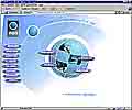 This customer wanted a blue theme with round shapes and colour
fades. I designed a page based on four standing and reclining concentric ellipses with various diametres, with
the main element, the ball, repeated along a diagonal, falling from the upper left corner. The page is divided
into a left pane with buttons, and a larger, right part where all the information goes. The left pane is one big,
clickable picture, because it loads faster than a lot of separate button images. The main page has the Earth as
a background image, to not disturb the download of the four buttons in front. They download in only 10 seconds,
but their alternative text appears in about one second. The result was a fast page, enjoyable to the eye. (The
annoying banding in the colour fades does not occur in reality.)
This customer wanted a blue theme with round shapes and colour
fades. I designed a page based on four standing and reclining concentric ellipses with various diametres, with
the main element, the ball, repeated along a diagonal, falling from the upper left corner. The page is divided
into a left pane with buttons, and a larger, right part where all the information goes. The left pane is one big,
clickable picture, because it loads faster than a lot of separate button images. The main page has the Earth as
a background image, to not disturb the download of the four buttons in front. They download in only 10 seconds,
but their alternative text appears in about one second. The result was a fast page, enjoyable to the eye. (The
annoying banding in the colour fades does not occur in reality.)
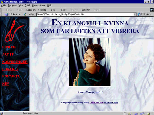
Opera Singer Chose Classical Look with Velvet
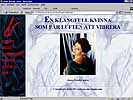 Anna Norrby is an opera
singer and moderator. She wanted an elegant theme with a velvet left frame. The whole site is in various
dark blue tones. It uses the well-known layout with with a left frame with links in red, and a right frame holding
the dynamic information. The background of the starting page is based on one of Anna's own water-colour paintings.
There are some music samples included, in wav format for the conoisseur, and in mp3 format for those with limited
bandwidth. Thanks to the good preparations, the whole site was ready and put on the Internet in only 12 hours.
Anna Norrby is an opera
singer and moderator. She wanted an elegant theme with a velvet left frame. The whole site is in various
dark blue tones. It uses the well-known layout with with a left frame with links in red, and a right frame holding
the dynamic information. The background of the starting page is based on one of Anna's own water-colour paintings.
There are some music samples included, in wav format for the conoisseur, and in mp3 format for those with limited
bandwidth. Thanks to the good preparations, the whole site was ready and put on the Internet in only 12 hours.
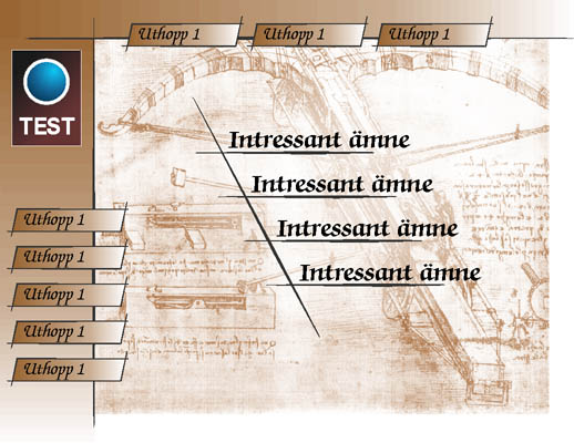
Brown Background and Thin Lines, Hand-drawn Style
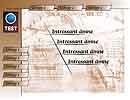 Who has made better drawings than Leonardo da
Vinci? His sketch of a giant cross-bow was used for background in this website suggestion to a customer who wanted
brown tones and thin lines. Everything looks like it was hand-drawn with ink. The typeface on the
page, the quite unusual Zapf Calligraphic, was chosen because it went very well with Leonardo's style. Sober and
classical.
Who has made better drawings than Leonardo da
Vinci? His sketch of a giant cross-bow was used for background in this website suggestion to a customer who wanted
brown tones and thin lines. Everything looks like it was hand-drawn with ink. The typeface on the
page, the quite unusual Zapf Calligraphic, was chosen because it went very well with Leonardo's style. Sober and
classical.
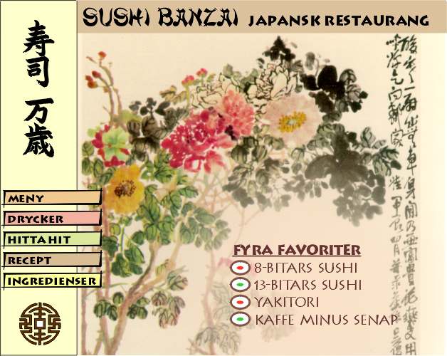
Japanese Restaurant
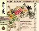 If I would ever be asked to make
a website for a Japanese Sushi resturant, I would hand them this proposition. Beautiful, with subdued colours,
and an attempt to keep the buttons and bars in the same colours as the backgroumd. Also, the fonts have a hint
of Japanese in them, without being too hard to read. (Should someone knowledgable in Japanese discover that the
background is Chinese, I regret that. After all it's only a proposition.)
If I would ever be asked to make
a website for a Japanese Sushi resturant, I would hand them this proposition. Beautiful, with subdued colours,
and an attempt to keep the buttons and bars in the same colours as the backgroumd. Also, the fonts have a hint
of Japanese in them, without being too hard to read. (Should someone knowledgable in Japanese discover that the
background is Chinese, I regret that. After all it's only a proposition.)
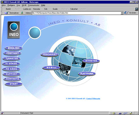
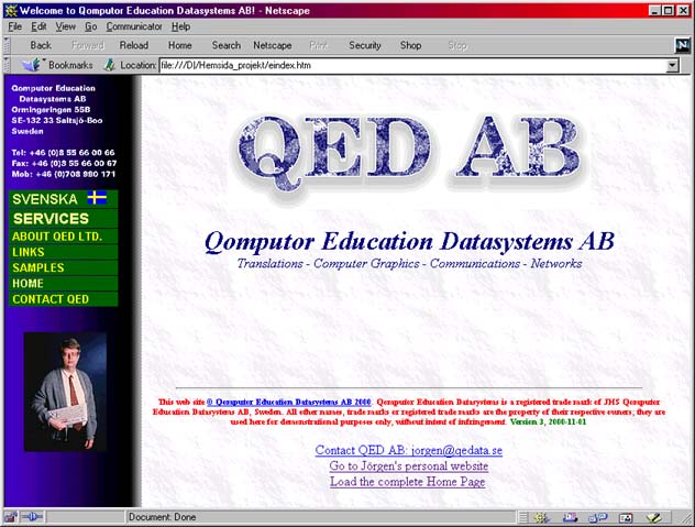
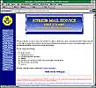
QED AB
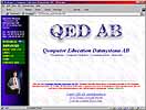 You probably recognize this one. It's the website
you are reading right now. I've put it here for the sake of completeness only. A traditional website with buttons
to the left, with a minimum of knick-knacks. Frames have been employed because they facilitate usage and lend structure
to the website.
You probably recognize this one. It's the website
you are reading right now. I've put it here for the sake of completeness only. A traditional website with buttons
to the left, with a minimum of knick-knacks. Frames have been employed because they facilitate usage and lend structure
to the website.
The Information Quotient Says it All
|
I have invented a proprietary system for judging the usefulness of a website. I call it The Information Quotient
(IQ, © Qomputor Education Datasystems AB).
The idea behind it is that a human being would rather read high contrast text, and not too much at a time. If the
page is too packed with information, we soon become "saturated" and disorientated and will perhaps choose
another page. Too little information, on the other hand, is not good either; the page has to convey some amount
of information.
What Makes a Website Easy to Read?
A good structure, easy overview and an Information Quotient that makes it possible for us to grasp
the page in one glance. The fine thing about hyperlinks is that it is possible to present fairly simple and structured
information, and link it up to larger amounts of information.
When you first set your eyes on a web page, you must start to filter:
- What is only text and what can I click on?
- What is it I am interested in?
If there are too many Information Units this automatic process will not start. Instead you will
begin quite randomly at the upper left and the stupidly plow through the page, hunting for a loose end to start
at. If the layout is too bad, or there are too many Information Units you will never succeed, and
instead choose another site.
Calculate the Quotient
Information Quotient (IQ) = (kpix*(1,310,720/your_resolution))/iu
- Calculate how many pixels (pix) the page needs to be adequately and fully viewed. Usually somewhere
between 300,000 and 500,000.
- Divide by 1000 (giving the kpix value).
- Calculate the number of pixels on your screen (with*height), giving your_resolution. This value compensates
for different screen resolutions.
- Count the number of Information Units (iu) on the page. One link, one text block, one headline or one
picture counts as one iu.
- Insert the values in the formula above and calculate IQ. An adequate Information Quotient lies somewhere
between 12 and 16.
Examples
| Many Portals (e.g. the early versions of the Swedish Passagen and Torget in 1998, Swedish web sites raised
to the skies by the media) had IQ's between 4 and 5; way too intricate to grasp. The trend
continues with Swedish Spray. |
| The website of the Vatican www.vatican.va was 16.26 in 1998, and was a pleasure to read. |
| Sparse websites, having an IQ over 30 are too empty and insignificant. They simply carry too little
information. |
The Big Picture
The worst sin to be committed on the slow Internet we have today, and probably will have to live with in a foreseeable
future, is to have too many or too large pictures.
I always try to, if not minimize the amount of pictures, to minimize their file size. A page containing some
25 pictures, which take 15 minutes to load will make most people bored. A page should be designed with the modem
user in mind, not the one with a direct network connection. A picture could be manipulated in many ways to become
smaller. Mostly, we are talking about advanced image processing.
My default is to have smaller thumbnail pictures in the text, and use links to full size representations of
the pictures, for those who want to wait. It gives everyone a chance.
Terrible Backgrounds and Impossible Colour Combinations
Many people choose black, blue or red backgrounds without restraint for their websites, mystic background pictures
or use text with a colour of such low or strange contrast with the background that it can be read only with great
difficulty.
It is obvious that our eyes are made for reading black characters on a white background, which is something
we have been taught since childhood. Changing this just because you can have blue characters on a violet
background, doesn't really increase readability.
It is possible to have background pictures, but they should be low-profile, low-contrast and interfere
with the text as little as possible.
Cohesion
The user must be able to comprehend that he is actually moving within the same website, as he flips the pages.
That's why it is important to use the same environment everywhere. The same typeface, the same colour combinations
and the same background pictures everywhere.
Path: Home
Page > [Services
>] Websites > Websites Background
 The Swedish Post Office's Hybrid Mail System, a semi-electronic,
semi-physical alternative to ordinary paper mail, was to be presented to the EU, and the Post Office chose to present
it in the form of a website. I got a raw text from the Post Office and made all the illustrations and created the
environment of the site myself. To tell the truth, I got a few, not very uplifting illustrations to redesign. Below
you see the result.
The Swedish Post Office's Hybrid Mail System, a semi-electronic,
semi-physical alternative to ordinary paper mail, was to be presented to the EU, and the Post Office chose to present
it in the form of a website. I got a raw text from the Post Office and made all the illustrations and created the
environment of the site myself. To tell the truth, I got a few, not very uplifting illustrations to redesign. Below
you see the result.